

Did you know that over 90% of ocean-themed art features the powerful, dynamic form of a breaking wave? This single element captures the raw energy and beauty of the sea, making it a cornerstone of marine art.
I’m thrilled to share my professional approach to illustrating these magnificent waves. This skill captivates artists of all levels. It remains one of the most rewarding subjects in nature-inspired artwork.
This guide provides a comprehensive path. I will walk you through everything required to master this form. We will cover fundamental structure and advanced techniques. These methods will elevate your drawing to a professional standard.
My goal is to help you transform simple sketches into stunning works of art. You will learn to observe and capture the dynamic movement of water. By the end, you will have a solid foundation in wave anatomy and perspective.
Key Takeaways
- Wave illustration is a foundational skill in ocean-themed artwork.
- This guide is designed for artists at any experience level.
- You will learn to break down complex wave forms into simple steps.
- Mastering structure and movement is key to a realistic result.
- Professional techniques will be shared to enhance your artistic practice.
- Consistent practice is the most important factor for improvement.
Introduction to Drawing Waves
The journey into wave art often begins with recognizing the intricate patterns hidden within what appears to be simple water movement. Many artists start with casual notebook sketches, unaware of the complex dynamics they’re attempting to capture.
My First Impressions When Approaching Wave Art
When I began serious wave illustration, I discovered that curved lines contain entire stories of ocean energy. What seemed simple revealed complex rhythms requiring careful observation.
My early attempts taught me there are many ways to interpret water in motion. This drawing wave guide covers fundamental techniques while encouraging personal artistic discovery.
The key to successful wave art lies in understanding anatomy rather than copying photographs. This approach allows creating convincing water movement from imagination.
| Aspect | Beginner Approach | Advanced Technique |
|---|---|---|
| Observation | Basic shape copying | Understanding wave physics |
| Line Quality | Stiff, tentative strokes | Fluid, confident movements |
| Skill Level | Foundational practice | Professional execution |
| Creative Freedom | Reference-dependent | Imagination-driven |
Progressing from casual sketches to professional work requires patience. Regular practice produces noticeable improvement at every skill level.
What struck me most was how wave art deepened my connection to nature. It trained my eye to see water movement with artistic intention everywhere.
Gather Your Supplies and Prepare Your Workspace

The foundation of any successful wave illustration lies in thoughtful material selection and workspace organization. Having the right tools within reach transforms the creative process.
I begin every project by gathering essential materials. This prevents interruptions and maintains creative flow.
Choosing the Right Tools and Materials
My basic toolkit includes quality paper or cardstock, a reliable pencil, and a thin black marker. These form the core of any wave art project.
For colored illustrations, alcohol-based markers work best. Brands like Bic, Sharpie, and Copic allow smooth blending. I keep multiple blue tones available for water depth.
The right paper matters significantly. Heavier cardstock prevents bleeding with markers. Smoother surfaces yield cleaner lines.
Essential finishing tools include a white Gelly Roll pen for highlights. I also keep both click and Pink Pearl erasers nearby. These correct mistakes and create effects.
Workspace setup impacts productivity. A well-lit, organized area keeps focus on creation. I recommend having wave references available. This ocean wave tutorial offers excellent visual guidance.
Proper preparation ensures your vision translates effectively onto the page. It’s the first step toward professional results.
Understanding the Wave Structure and Basic Shapes

The secret to convincing wave illustrations lies in understanding the fundamental components that create water’s natural movement. I approach each wave by identifying its core anatomy before adding details.
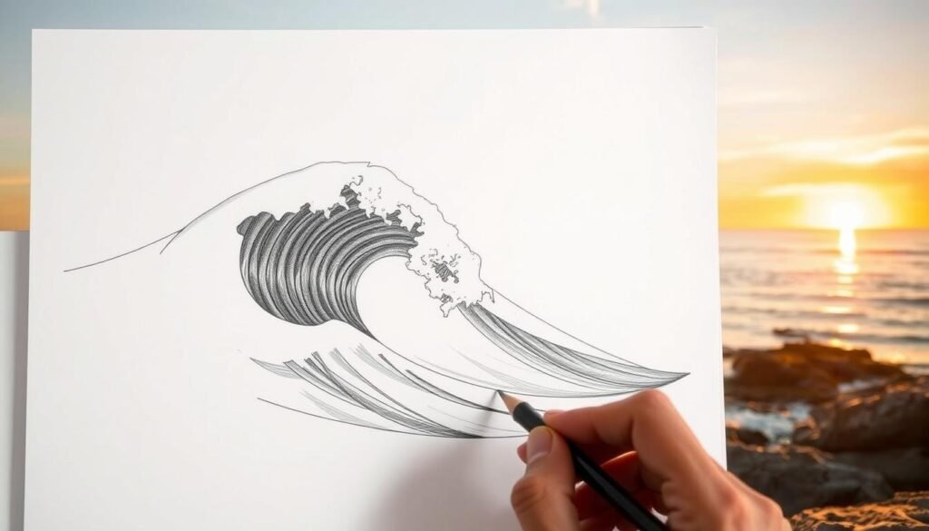
Every wave contains essential elements that define its character. The curve of approaching water builds toward the crest where the wave peaks. Below this, the curl or lip folds over, creating spray and foam.
Breaking Down the Curve and Crest
I start with the basic shape of the curve wave, sketching the main flow. Adding a parallel line below the curl defines the lip’s thickness. This simple technique creates immediate dimension.
Flow lines beginning at the lip curve around to suggest liquid roundness. Continuing these lines downward with a half-oval shape shows the concave curve of the wave face. This approach makes the water appear to wrap around an invisible cylinder.
Exploring Different Perspectives and Horizon Lines
Perspective transforms basic shapes into dynamic scenes. The horizon line represents your eye level, while vanishing points create depth. Changing these elements produces dramatic variations.
| Perspective Type | Horizon Line Position | Vanishing Point | Visual Effect |
|---|---|---|---|
| Barrel View | High | Left | Face against wave |
| Pier View | High | Right & Left | Looking down |
| Paddler’s View | Low | Center | Water level |
| Bird’s Eye | Off image | Far sides | Aerial perspective |
Mastering these perspective techniques allows you to create authentic ocean scenes. This wave structure guide offers additional insights into professional approaches.
Master Guide: How to Draw Waves
Mastering wave anatomy begins with confident strokes that define the water’s rising motion. This approach transforms basic sketches into dynamic ocean scenes.
Laying Out Your Primary Wave Outline
I start with a long, sloping line moving across the page. This initial stroke establishes the wave’s basic form and direction.
The curve gently rises then rounds off at the peak. Connecting both ends creates a tadpole-like shape representing the crest.
For the dramatic curl, I extend a large C-shape from the right section. This element captures the wave folding under itself.
| Outline Element | Starting Position | Stroke Direction | Visual Result |
|---|---|---|---|
| Primary Curve | Left page edge | Rightward slope | Basic wave form |
| Crest Definition | Line endpoints | Swooping connection | Tadpole shape |
| Curl Extension | Right crest section | Backward C-curve | Folding water |
Defining the Rhythm and Flow of the Wave
Flow lines bring movement to the static outline. I curve these lines around the lip to show liquid volume.
The top wave section receives special attention. Small U-shapes create whitewater along the crest edge.
Water droplets around the edge enhance motion. Interior lines add depth to the wave face.
The rhythm of ocean water emerges from carefully planned strokes that follow natural movement patterns.
This method creates convincing water texture. Each element contributes to the overall sense of flowing water.
Step-by-Step Process: From Sketching to Detailing

The transformation from basic shapes to realistic wave forms occurs through a systematic approach to line work. This method ensures your artwork captures water’s natural movement and energy.
I begin each wave illustration by establishing the horizon. This critical reference line divides the paper at the halfway point. It determines where the wave breaks and curls.
Drafting a Fluid, Dynamic Line
My first step involves creating a cylindrical guide shape. I draw a large circle bisected by the horizon line. Then I add a matching curved line about three inches to the right.
Connecting these shapes with horizontal lines forms a sideways cylinder. This three-dimensional form helps visualize water wrapping around an invisible tube. All subsequent lines follow this curved structure.
At the horizon, I sketch squiggly lines representing whitewater. These organic shapes show where the wave actively breaks. I vary their placement to avoid uniformity.
The next step connects these scraggly lines to the cylinder. I make sure each curved line flows backward in a C-shape. This creates the impression of water moving around the form.
To extend the wave, I add squiggly lines along diagonal planes. These follow the cylindrical shape upward. They suggest water being drawn into the wave from the ocean surface.
Finally, I trace over my initial pencil lines to rough up the edges. Moving water shouldn’t have crisp, clean boundaries. This technique makes the drawing appear more natural and dynamic.
Throughout this process, I continuously evaluate the composition. Each step builds upon the previous one. The result is a wave with convincing volume and movement.
Adding Depth with Lines, Curves, and Shading

The moment a wave illustration transforms from flat to dimensional occurs when light and shadow techniques are properly applied. This stage brings your artwork to life with convincing realism.
I refine the flow lines throughout the wave structure to create natural tapering. Each line becomes progressively less steep as I move away from the curl toward the shoulder.
Techniques for Light, Shadow, and Texture
Realistic spray involves thin, wispy lines extending upward from the crest. I keep these delicate and varied to capture windblown water particles.
For foam explosion at the wave base, I draw series of explosion lines that gradually increase in size. Adding a foam ball inside the wave tube creates additional visual interest.
Shading brings the wave face to life with smaller contour lines following the water’s curve. These lines darken as I work deeper into the tube where light decreases.
| Shading Technique | Application Area | Tool Used | Visual Effect |
|---|---|---|---|
| Contour Lines | Wave Face | Pencil | Defines curvature |
| Crosshatching | Tube Interior | Fine Pen | Adds depth |
| Eraser Highlights | Lip Edge | Sharp Eraser | Creates sparkle |
| Gradual Darkening | Inside Wave | Multiple Tools | Shows depth |
Crosshatching builds darker values in shadowed areas. I layer intersecting lines at different angles for dimension.
One critical technique involves using a sharp eraser to maintain a defined white line under the lip. This creates visual separation between the curling crest and wave face.
I also use my eraser to add white highlights on the lip edge. This gives the water characteristic sparkle. The key is suggesting texture rather than drawing every foam bubble.
These professional techniques transform basic outlines into convincing water representations. For comprehensive guidance, explore this detailed wave illustration resource.
Using Markers and Colored Pencils Effectively

The right coloring techniques can elevate your marine illustrations from amateur to gallery-ready. Proper application of color brings dimension and realism to water movement.
Selecting the Right Art Supplies
I always recommend alcohol-based markers for professional results. Brands like Bic, Sharpie, and Copic provide the smooth blending you need use for realistic water effects.
These markers work best on heavy cardstock that prevents bleeding. The paper quality significantly impacts how colors interact and blend together.
| Marker Type | Blending Capability | Best For | Drying Time |
|---|---|---|---|
| Alcohol-Based | Excellent | Seamless transitions | Medium |
| Water-Based | Limited | Graphic styles | Fast |
| Brush Tip | Good | Detailed work | Variable |
Blending Colors for a Realistic Look
Successful blending requires working while colors remain wet. You need use similar hues like light blue, medium blue, and dark blue for smooth transitions.
I avoid solid fills that create flat artwork. Instead, I layer multiple tones to build depth. The color wave effect comes from gradual value changes.
For creative variations, you could also experiment with unconventional palettes. Pink, purple, or sunset hues offer dramatic alternatives to traditional blue schemes.
Final white highlights with a Gelly Roll pen make the water sparkle. Colored pencils add texture when combined with marker work.
Enhancing Your Drawings with Backgrounds and Additional Elements

Transforming a basic wave study into a complete ocean scene requires thoughtful integration of background elements and narrative details. This approach elevates your artwork from technical exercise to compelling visual story.
I begin by establishing the environment around my central subject. The background should support rather than dominate the composition.
Creating a Complementary Horizon Line
The horizon line placement dramatically affects your scene’s mood. A low horizon creates towering, dramatic waves. A higher horizon produces intimate, eye-level perspectives.
I carefully position this fundamental element before adding any secondary components. This ensures proper scale and spatial relationships throughout the drawing.
| Background Element | Placement Area | Visual Impact |
|---|---|---|
| Distant Landmass | Upper Third | Adds scale and location context |
| Cloud Formations | Sky Area | Creates atmospheric depth |
| Flying Birds | Upper Corners | Introduces movement and life |
| Smaller Waves | Foreground/Sides | Enhances ocean realism |
Infusing Life with Surfers and Sea Creatures
Adding figures transforms static water into dynamic narratives. A surfer carving down the wave face immediately suggests action and energy.
Sea creatures like dolphins breaching alongside the wave create natural harmony. I position these elements on the side to maintain focus on the main subject.
For complex scenes, I sometimes create a series of receding waves with multiple elements. This approach builds comprehensive ocean environments that feel alive and authentic.
Overcoming Common Challenges and Learning from Mistakes

The most common obstacle I’ve observed in wave drawing involves repetitive compositions that lack the dynamic energy of real ocean movement. Many creators fall into patterns that make their artwork look formulaic rather than inspired by nature’s variability.
One frequent mistake involves creating a wave peak by mirroring identical sides. In reality, each side of a peak has distinct characteristics based on swell direction. The right and left sections should look different to capture authentic water movement.
Avoiding Repetitive Patterns and Refining Your Style
I’ve learned that making a lot of varied illustrations prevents creative stagnation. Don’t limit yourself to basic formations—explore hollow barrels, freight-trains, and paper-thin waves. Each type offers unique challenges that elevate your skills.
| Common Challenge | Typical Mistake | Effective Solution |
|---|---|---|
| Repetitive compositions | Drawing the same wave repeatedly | Create a series from different perspectives |
| Unrealistic peaks | Mirroring identical sides | Vary steepness and shoulder angles |
| Limited creativity | Sticking to one wave type | Experiment with various formations |
| Static artwork | Fixed horizon point | Change viewing level and angle |
The best way to improve involves viewing mistakes as learning opportunities. Challenge yourself to complete a series over time. This approach develops both technical skills and creative problem-solving abilities.
Remember to keep your practice enjoyable. When you look forward to creative sessions, you’ll naturally produce better work. Embracing challenges with a growth mindset ensures steady progress at every skill level.
Conclusion
Your path to mastering wave illustration now stands on a solid foundation of professional techniques and creative principles. Each step we’ve explored builds toward creating dynamic ocean scenes.
From the initial pencil sketch on your page to defining the crest and curve wave formations, every element contributes to realistic water movement. The inside wave details and dramatic peak formations bring your artwork to life.
I encourage you to make sure your practice remains consistent. You could also explore this wave drawing tutorial for additional guidance.
Remember that artistic growth comes through regular creation. Keep your paper and tools ready for spontaneous sessions. Your journey with ocean waves offers endless creative possibilities.